Understanding Line Histograms: Visualizing Data Distributions Effectively
Discover how line histograms combine the best of histograms and line charts to reveal data distributions, patterns, and insights with exceptional clarity.
Discover how line histograms combine the best of histograms and line charts to reveal data distributions, patterns, and insights with exceptional clarity.
Building on our comprehensive chart type guide and our exploration of bar histograms for categorical comparison, we now examine line histograms—a powerful hybrid visualization that bridges traditional histograms with the continuous flow of line charts. When you need to understand data distributions while maintaining visual continuity, line histograms offer unparalleled insights.
1. Why Line Histograms Excel at Distribution Visualization
Line histograms represent a sophisticated evolution of traditional bar histograms, connecting the tops of histogram bars with a continuous line to create a smooth visual representation of data distributions. This hybrid approach combines the frequency representation of histograms with the continuous flow of line charts, making it easier to identify patterns, trends, and distribution characteristics.
The connected line creates a visual narrative that guides the eye across the distribution, revealing peaks, valleys, skewness, and other statistical properties at a glance. This makes line histograms particularly valuable for statistical analysis, quality control, and any situation where understanding the shape of your data is crucial.
Whether you're analyzing product quality metrics, financial returns, student test scores, or customer behavior patterns, line histograms transform complex distribution data into immediately understandable visual insights that inform decision-making.
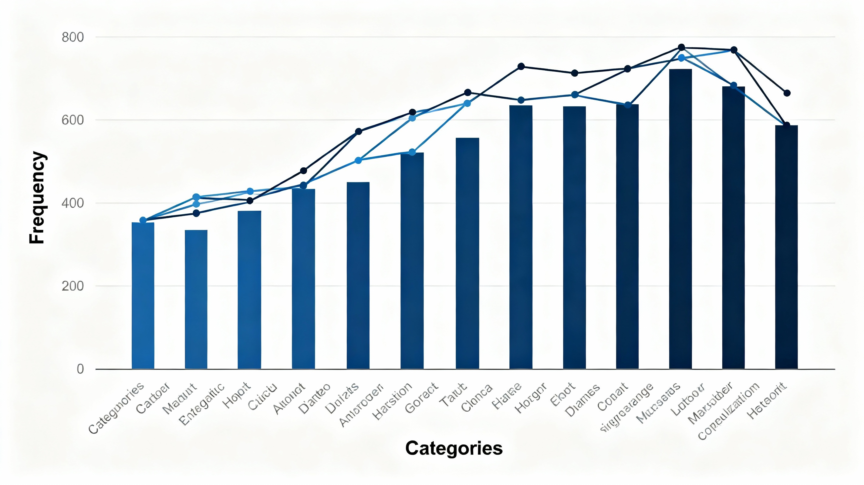
Simple line histogram displaying frequency distribution with connected line overlay
See Your Data in Action
Ready to visualize your own data? Try our AI-powered analysis tool and transform your data into beautiful insights.
2. Types of Line Histograms and When to Use Each
Let's explore the main variations of line histograms and understand their optimal applications:
a. Simple Line Histograms:
Perfect for displaying a single distribution clearly, simple line histograms connect the frequency bars with a single continuous line. They work exceptionally well for basic distribution analysis, quality control charts, and any situation where you need to highlight the overall shape of one dataset.
b. Multiple Line Histograms:
When you need to compare distributions across different groups or time periods, multiple line histograms overlay several distributions on the same chart. They're ideal for comparing product performance across batches, demographic analysis, or tracking how distributions change over time.
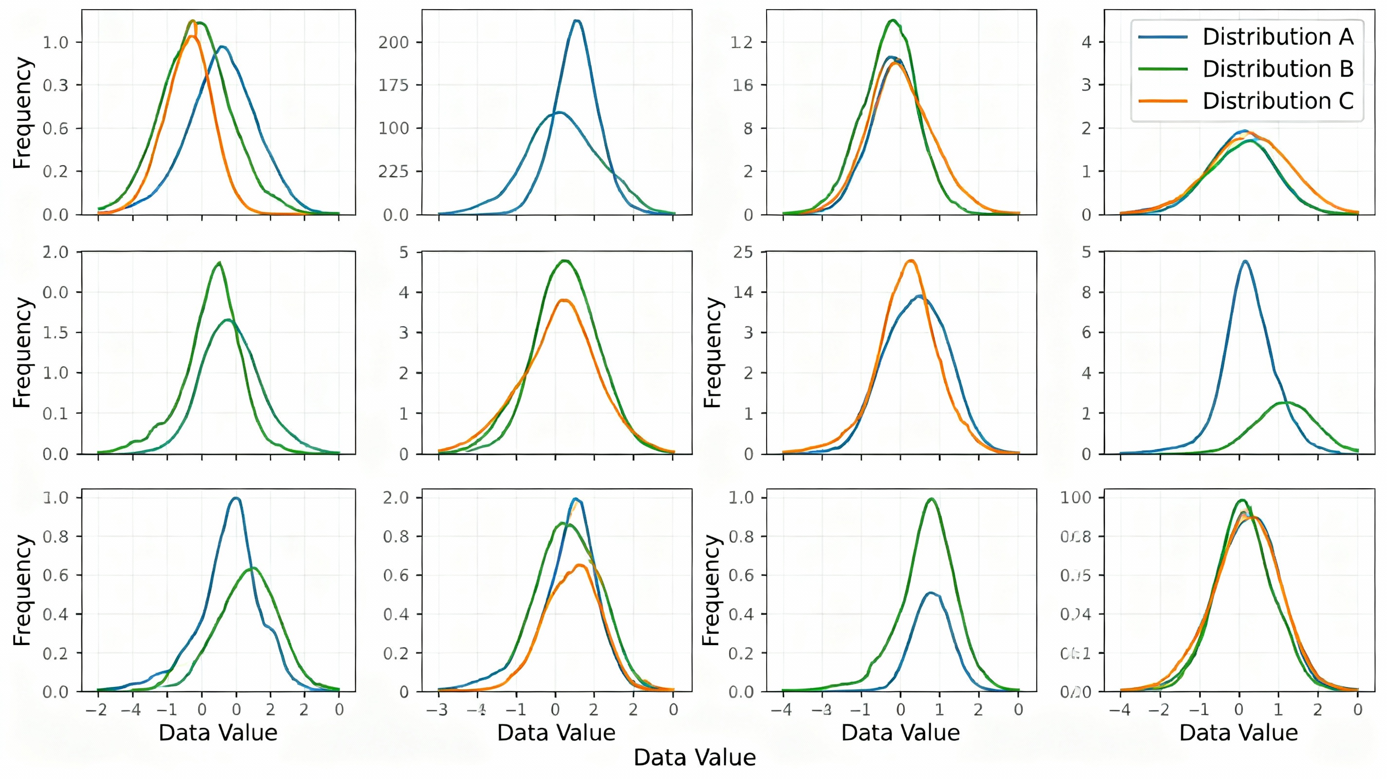
Multiple line histograms comparing different distribution patterns and characteristics
c. Smooth Density Line Histograms:
These use kernel density estimation to create smooth, continuous curves that approximate the underlying distribution. They're excellent for statistical analysis, revealing subtle patterns that might be obscured by traditional binning, and work well when you need to estimate the probability density function.
d. Cumulative Line Histograms:
Also known as ogive charts, these show the cumulative frequency distribution, plotting the running total of frequencies. They're particularly useful for percentile analysis, quality control (showing what percentage falls below certain thresholds), and understanding distribution spread.
3. Best Practices for Creating Effective Line Histograms
To maximize the impact and accuracy of your line histograms, follow these proven guidelines:
a. Choose Appropriate Bin Width:
The foundation of any good histogram is proper binning. Too few bins oversimplify the distribution; too many create noise. Use statistical rules like Sturges' formula or Scott's rule to determine optimal bin width based on your sample size and data variability.
b. Consider Sample Size:
Line histograms require sufficient data points to be meaningful. As a general rule, aim for at least 30-50 data points minimum, with larger samples (100+) providing more reliable distribution estimates.
c. Label Axes Clearly:
Always include descriptive axis labels and units. The X-axis should show the variable being measured, and the Y-axis should clearly indicate whether it represents frequency (count) or density (proportion).
d. Highlight Key Features:
Use annotations to highlight important distribution characteristics like mean, median, mode, standard deviation, skewness, or kurtosis. This helps viewers quickly identify the most important insights.
e. Manage Visual Complexity:
When using multiple line histograms, limit comparisons to 3-5 distributions maximum. Use distinct colors, line styles, or subtle transparency to differentiate overlapping distributions without creating confusion.
4. Real-World Applications Across Industries
Line histograms find practical applications across diverse sectors:
Manufacturing and Quality Control:
Monitor product dimensions, defect rates, or process capabilities. Line histograms help identify whether production processes are centered, capable, and stable over time.
Finance and Risk Management:
Analyze return distributions, portfolio volatility, or credit risk profiles. Financial analysts use line histograms to understand the probability of different outcomes and make informed investment decisions.
Education and Assessment:
Evaluate test score distributions, identify learning gaps, or track academic performance across different groups. Educators use line histograms to understand how well assessments measure student abilities.
Market Research:
Compare customer satisfaction scores, purchase behavior patterns, or demographic distributions. Market researchers leverage line histograms to identify target segments and understand consumer behavior patterns.
5. Advanced Tips for Professional Line Histograms
Take your line histograms to the next level with these sophisticated techniques:
a. Statistical Annotations:
Add reference lines for statistical measures like normal distribution curves, confidence intervals, or control limits. This provides context and helps viewers understand how their data compares to theoretical expectations.
b. Effective Color Usage:
Use color strategically—not just for aesthetics, but to encode meaning. Consider color gradients that reflect magnitude or use color to distinguish between different data categories while maintaining accessibility for color-blind viewers.
c. Interactive Enhancements:
In digital presentations, add interactivity like hover tooltips showing exact values, zoom capabilities for detailed analysis, or filters to focus on specific data subsets.
d. Contextual Benchmarking:
Compare your distribution against relevant benchmarks, industry standards, or historical data. This helps viewers understand whether their results are typical, exceptional, or concerning.
e. Distribution Shape Analysis:
Train viewers to recognize common distribution shapes (normal, skewed, bimodal, uniform) and what they indicate about your data. Include brief explanations of what different shapes might mean in your specific context.
Mastering line histograms requires understanding both the statistical foundations of distributions and the visual design principles that make complex data accessible. By following these guidelines and continuously refining your approach based on your specific data and audience, you'll create visualizations that not only display information but also tell compelling data stories that drive action and understanding.
See Your Data in Action
Ready to visualize your own data? Try our AI-powered analysis tool and transform your data into beautiful insights.