Master Bar Histograms: Your Guide to Effective Category Comparison
Discover why bar histograms are essential for comparing categories effectively and learn best practices for creating compelling data visualizations.
Discover why bar histograms are essential for comparing categories effectively and learn best practices for creating compelling data visualizations.
Building on our comprehensive chart type guide and our deep dive into line charts for time-series analysis, we now turn our attention to another fundamental visualization tool: the bar histogram. When you need to compare categories, show distributions, or highlight differences between groups, bar histograms are your most powerful ally in data storytelling.
1. Why Bar Histograms Excel at Categorical Comparison
Bar histograms are specifically designed to emphasize differences between categories through their rectangular bars, where height represents value. Unlike line charts that show trends over time, bar histograms create visual comparisons by placing bars side by side, making it immediately clear which categories perform better or have higher values.
The discrete nature of bars makes them perfect for categorical data, where each bar represents a distinct group or segment. This makes bar histograms indispensable for business reporting, market analysis, and performance comparisons where understanding relative differences is crucial.
Whether you're comparing sales across product lines, analyzing customer segments, or visualizing survey responses, bar histograms transform categorical data into immediately understandable visual insights that drive decision-making.
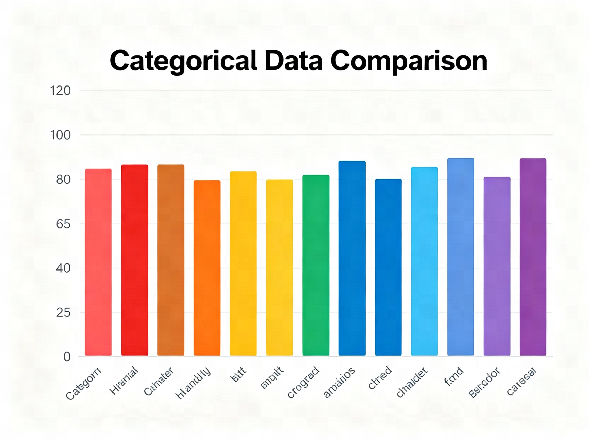
Simple bar histogram comparing categories
See Your Data in Action
Ready to visualize your own data? Try our AI-powered analysis tool and transform your data into beautiful insights.
2. Types of Bar Histograms and When to Use Each
Let's explore the main variations of bar histograms and understand their optimal use cases:
a. Simple Bar Histograms:
Perfect for comparing a single metric across different categories, simple bar histograms offer the cleanest way to show comparisons without distractions. They work exceptionally well for executive dashboards, performance summaries, and any situation where you need to highlight category differences clearly.
b. Grouped Bar Histograms:
When you need to compare multiple metrics across the same categories, grouped bar histograms shine. They're ideal for comparing performance across different time periods, regions, or segments simultaneously, allowing viewers to see both within-category and between-category differences.
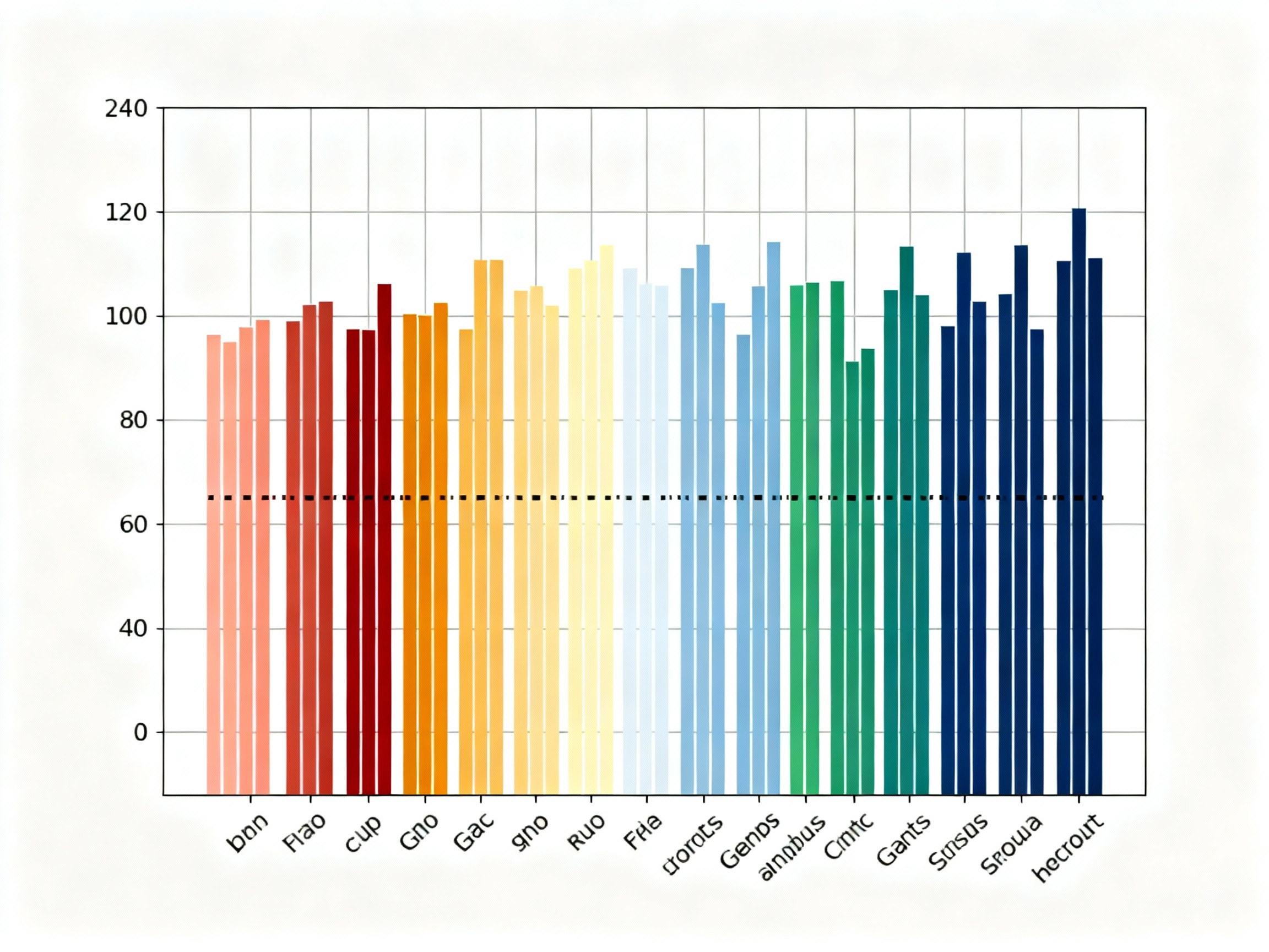
Grouped bar histogram for comparative analysis
c. Stacked Bar Histograms:
A variation of bar histograms that shows part-to-whole relationships within categories, stacked bar histograms are excellent for showing composition or contribution to totals. They're perfect for budget breakdowns, market share analysis, or any situation where you want to show both individual contributions and overall totals.
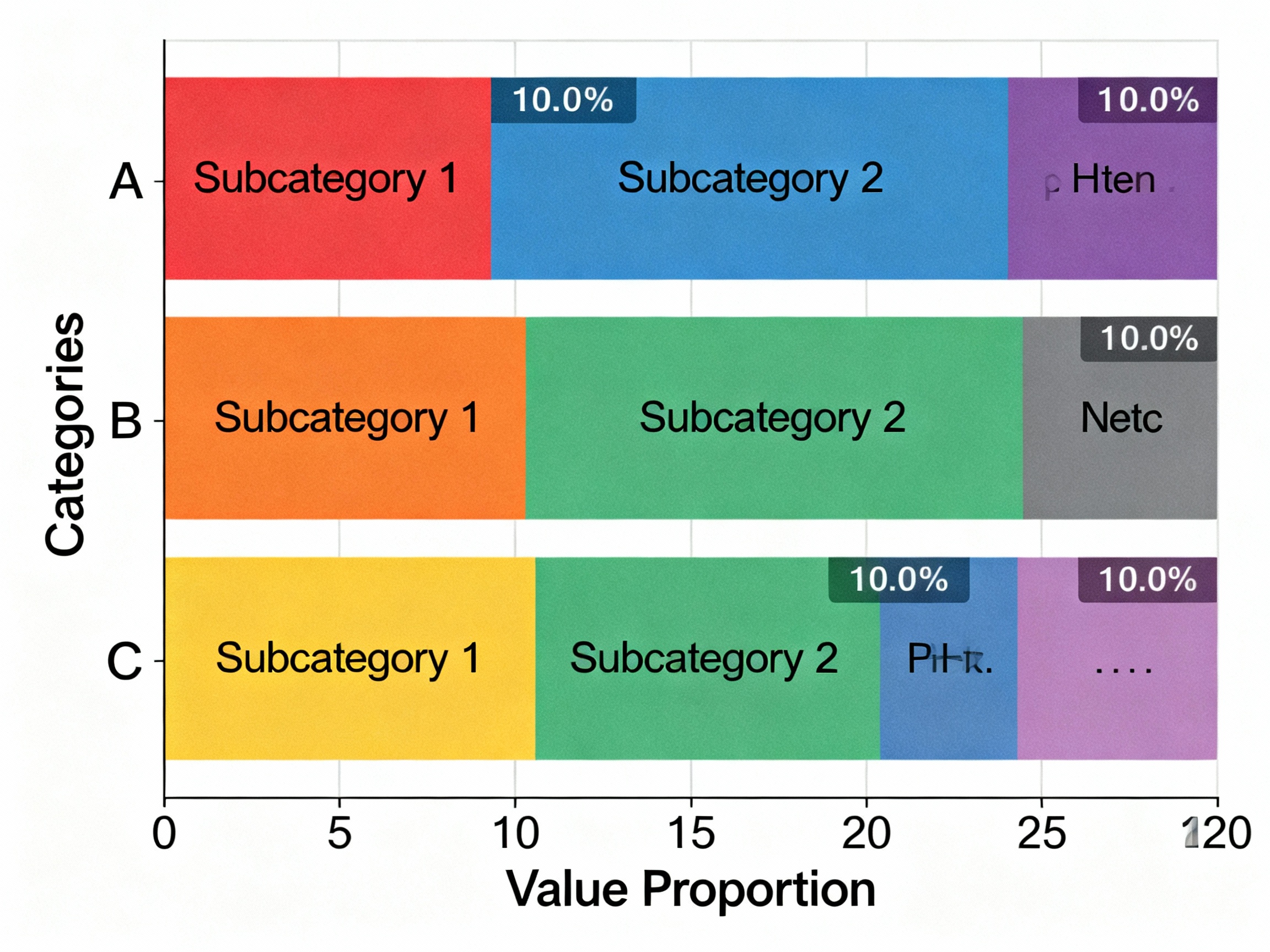
Stacked bar histogram for compositional analysis
d. Horizontal Bar Histograms:
These are useful when category names are long or when you have many categories to display. They help prevent label crowding, provide more space for descriptive category names, and work well for ranking data from highest to lowest.
3. Best Practices for Creating Effective Bar Histograms
To maximize the impact and clarity of your bar histograms, follow these proven guidelines:
a. Limit the Number of Categories:
The golden rule for bar histograms is to keep them readable. Stick to 5-10 categories maximum to avoid creating visual clutter that confuses rather than clarifies. Too many bars create charts that are impossible to interpret effectively.
b. Always Start Y-Axis at Zero:
Unlike some chart types, bar histograms must always start at zero to accurately represent proportional differences. Starting higher can dramatically distort the visual comparison and mislead viewers about the true relationships between categories.
c. Use Color Strategically:
Assign distinct, meaningful colors to each category and maintain consistency across all your visualizations. Use color to highlight important categories or to group related items, but avoid using color as the only differentiator for critical information.
d. Sort Bars Meaningfully:
Arrange bars in a logical sequence that supports your narrative - by value size for rankings, alphabetically when order doesn't matter, or chronologically for time-based categories. Thoughtful ordering makes your data story more intuitive and accessible.
e. Label Clearly and Completely:
Ensure all axes have descriptive titles, categories are clearly labeled, and values are easy to read. Consider adding data labels directly on bars when precise values are important to your audience.
4. Common Pitfalls to Avoid
While bar histograms are powerful tools, certain mistakes can undermine their effectiveness:
a. Overcrowding:
Too many categories or bars create visual noise that makes it difficult to extract meaningful insights. When you have many categories, consider grouping them or using alternative visualizations.
b. Inconsistent Scaling:
Different Y-axis scales across related charts can mislead viewers about relative performance. Always use consistent scales when comparing similar metrics.
c. 3D Effects and Unnecessary Styling:
Three-dimensional bars, gradients, and excessive styling can distort proportions and make accurate comparison difficult. Stick to clean, two-dimensional bars for professional presentations.
d. Dual-Axis Comparisons:
Placing two different metrics on the same chart with different scales can confuse viewers and make meaningful comparison impossible. Use separate charts or consider alternative visualization types for multiple metrics.
5. Practical Applications Across Industries
Bar histograms find applications in virtually every industry where categorical comparison is important:
Sales and Marketing:
Compare product performance, regional sales, or customer segment behavior to identify opportunities and optimize strategies.
Human Resources:
Visualize employee distribution by department, performance ratings across teams, or compensation comparisons to support workforce planning.
Operations:
Track production volumes by shift, defect rates by process, or efficiency metrics across facilities to drive operational improvements.
Finance:
Compare budget allocations, expense categories, or investment returns across different periods or portfolios.
Education:
Display student performance by subject, enrollment by program, or assessment results by demographic to inform educational strategies.
6. The Enduring Value of Bar Histograms
In an era of complex data and sophisticated analytics, bar histograms remain one of the most effective and widely used visualization tools. Their simplicity, clarity, and versatility make them indispensable for anyone who needs to communicate categorical comparisons effectively.
By following the best practices outlined above and avoiding common pitfalls, you can create bar histograms that not only inform but also persuade and drive action. Whether you're presenting to executives, sharing insights with colleagues, or publishing data for public consumption, mastering bar histograms will elevate your data storytelling capabilities.
Remember: the best visualizations are those that make complex data simple and actionable. Bar histograms achieve this by leveraging our natural ability to compare lengths and identify patterns quickly and accurately.
See Your Data in Action
Ready to visualize your own data? Try our AI-powered analysis tool and transform your data into beautiful insights.