Pie Charts No More?
Mathematicians like John Tukey believed there's no pie chart data that couldn't be better displayed in another format. Design theorist Edward Tufte stated: "The only worse design than a pie chart is several of them."
I don't think pie charts should be eliminated, but they're definitely overused. Here are five better alternatives:
1. The Waffle Chart
A grid of 100 squares where each square equals 1%, creating an intuitive visualization of percentages.
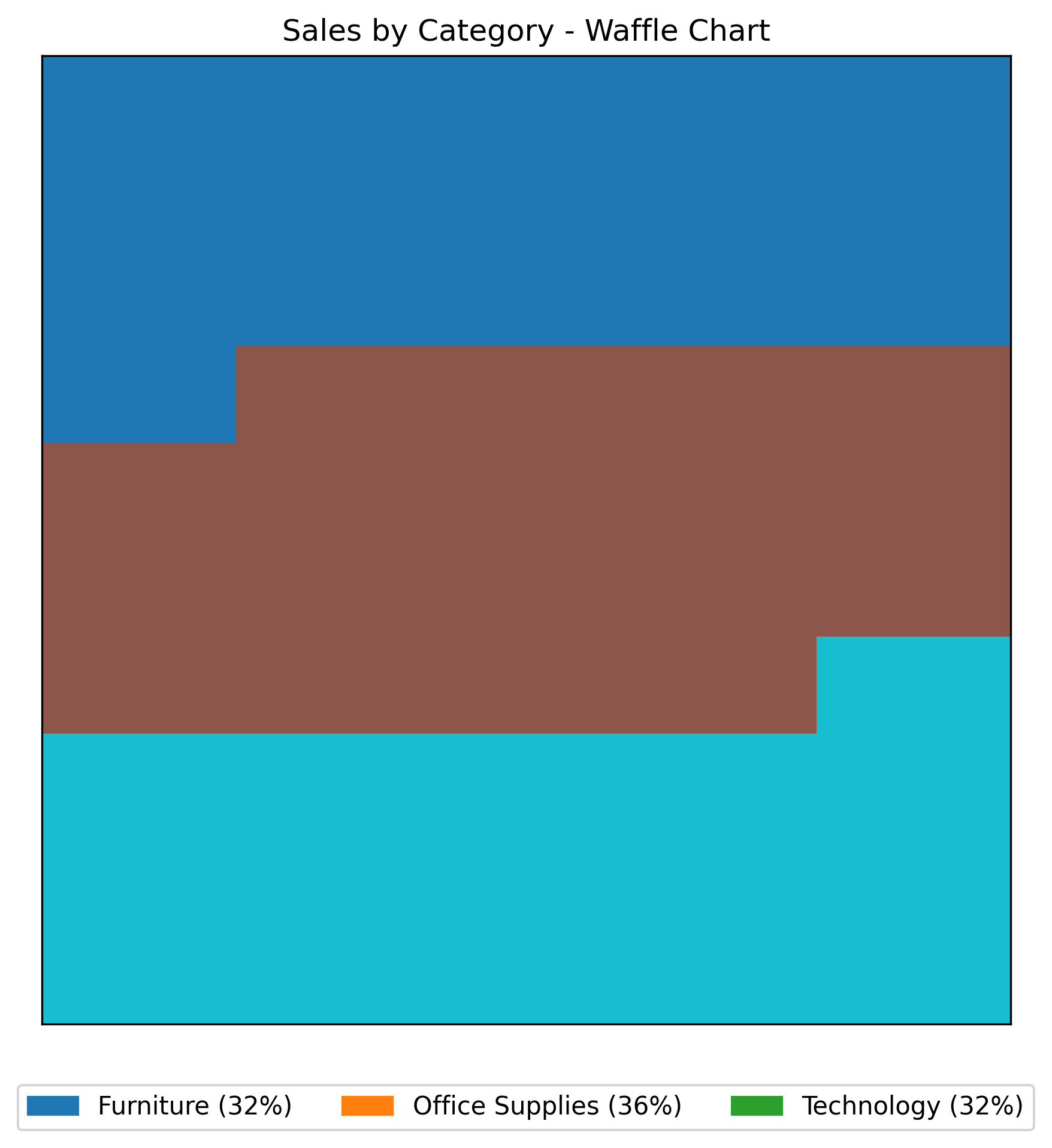
Waffle Chart
Pros:
- Shows parts of a whole using area instead of angles
- Easier to interpret exact percentages
- Works for single percentage displays
Cons:
- Gets cluttered with too many categories
- Limited labeling space
See Your Data in Action
Ready to visualize your own data? Try our AI-powered analysis tool and transform your data into beautiful insights.
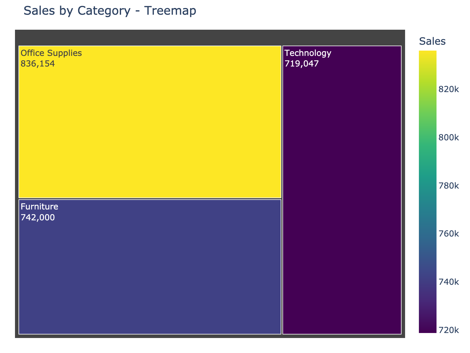
2. The Treemap
Uses nested rectangles where size corresponds to value, making proportion comparison straightforward.
Treemap
Pros:
- Better than pie charts for more than five categories
- Can show hierarchical data (categories within categories)
- Area comparison is more accurate than angle comparison
Cons:
- Less familiar to general audiences
- Can be complex with multiple levels
3. The Donut Chart
Similar to pie charts but with a central space that can display totals or other key metrics.
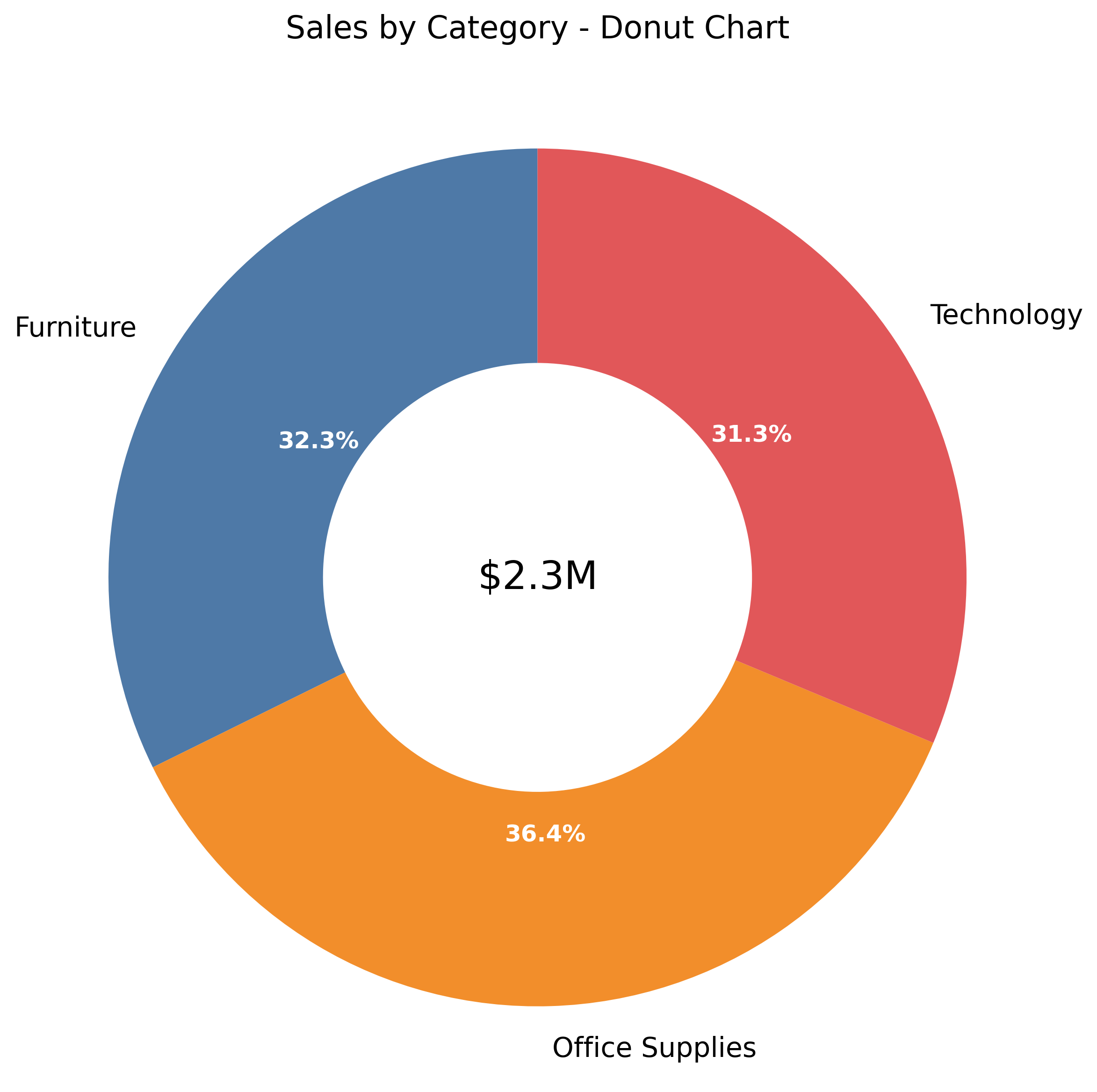
Donut Chart
Pros:
- Central area displays totals or key information
- Can function as a gauge for single percentages
- Familiar circular aesthetic with improved functionality
Cons:
- Still uses angles for comparison
- Limited for showing variance or ranking
4. The Bump Chart
Shows rankings over time, ideal for visualizing position changes across periods.
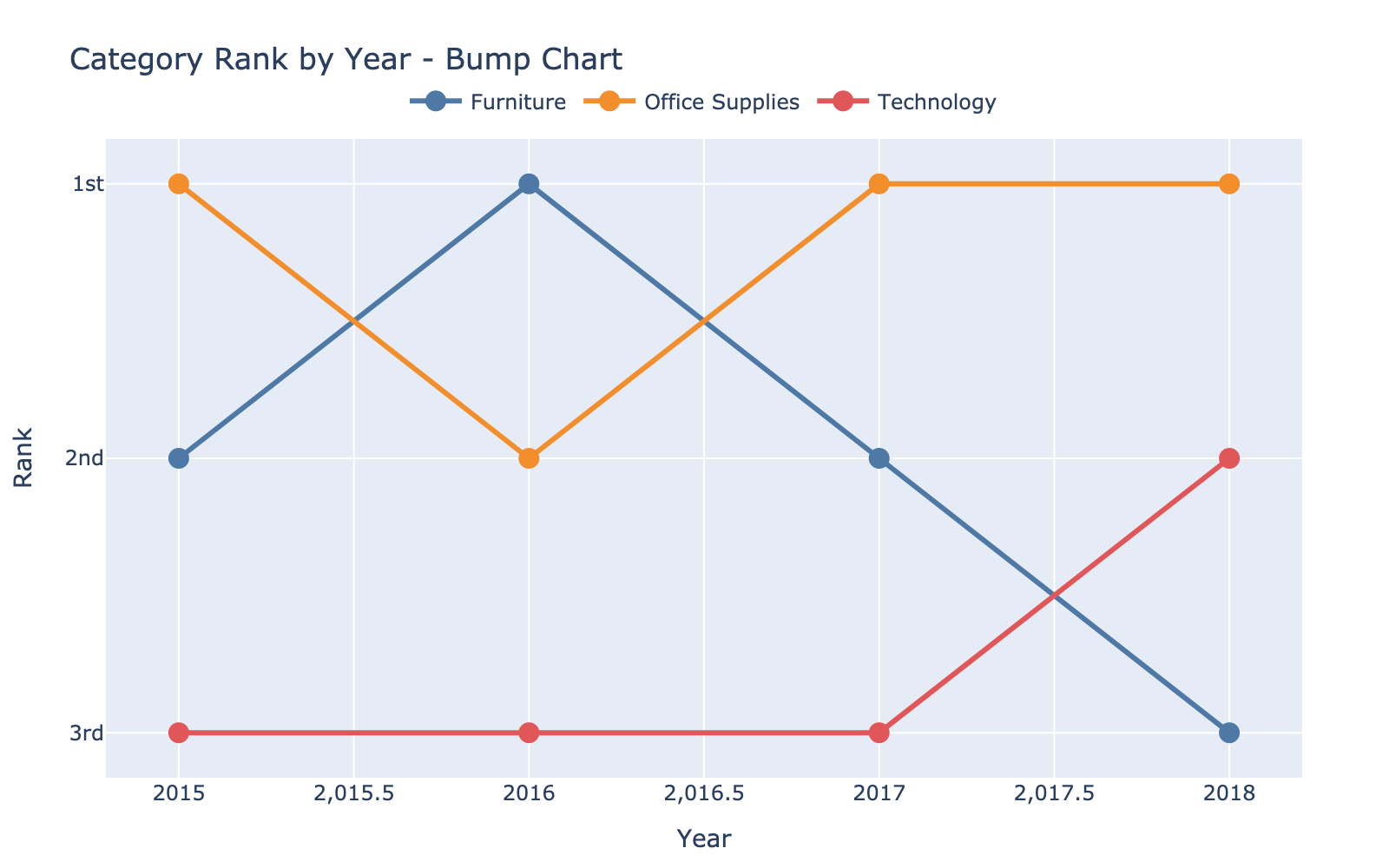
Bump Chart
Pros:
- Excellent for tracking rank changes
- Clear for competitive positioning
- Compact representation of multiple periods
Cons:
- Gets noisy with many categories
- Doesn't show relationship to the whole
5. The Dumbbell Chart
Shows the distance between two data points, perfect for displaying change or comparison.
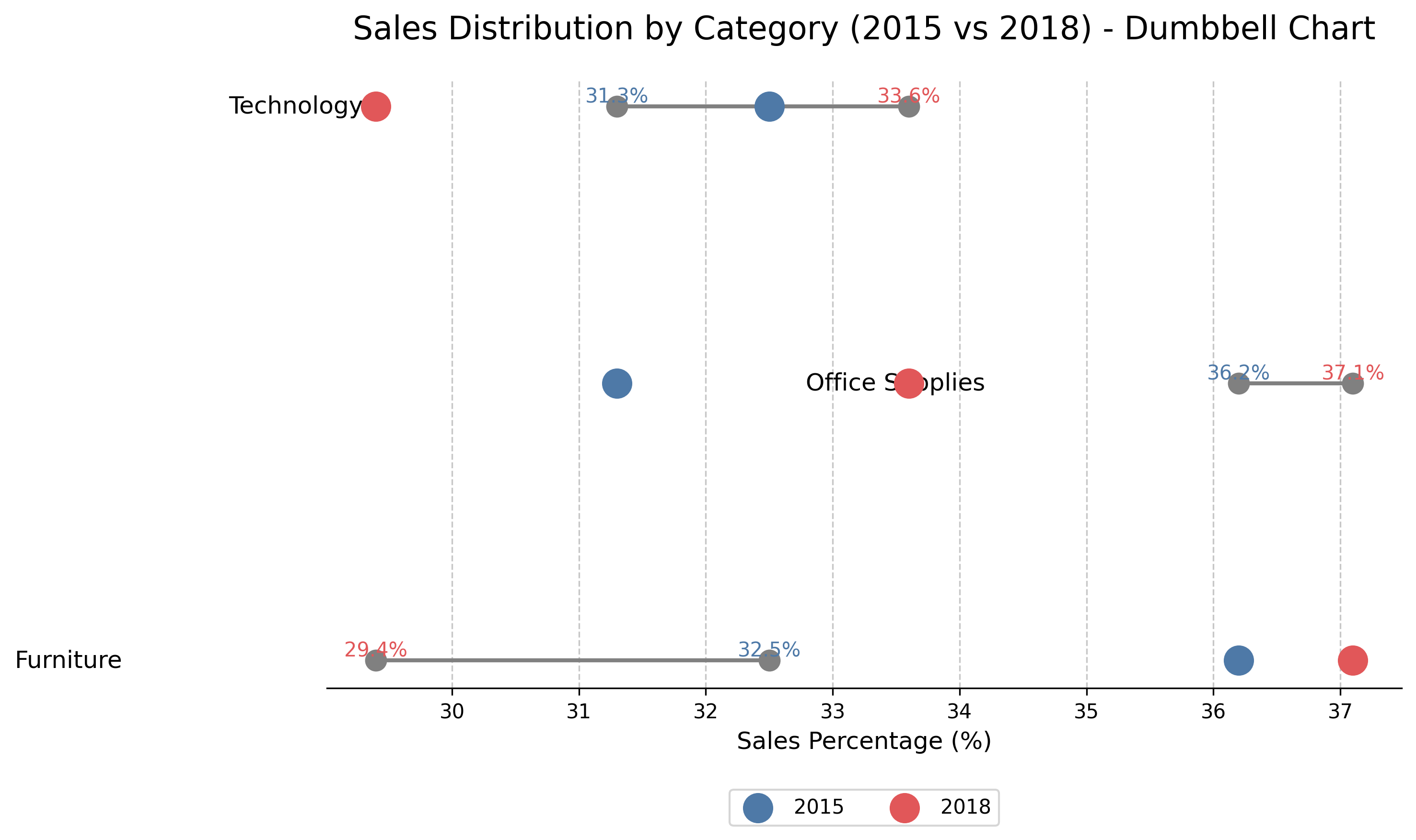
Dumbbell Chart
Pros:
- Highlights differences between two states
- Clear visual of distance between values
- Gives dimensional context to comparisons
Cons:
- Limited to comparing two points
- Not ideal for parts of a whole
Summary
Each chart serves a specific purpose:
- Use waffle charts for clear percentage visualization
- Choose treemaps when dealing with many categories
- Select donut charts when you need to emphasize totals
- Pick bump charts to track rankings over time
- Employ dumbbell charts to highlight changes between states
The right chart depends on what story your data needs to tell.
See Your Data in Action
Ready to visualize your own data? Try our AI-powered analysis tool and transform your data into beautiful insights.