Leveraging AI for Genetic Research
Genetic research demands analyzing massive, complex datasets. Researchers need to identify patterns, correlations, and statistical significance without getting lost in the noise.
The problem? Traditional genetic analysis requires specialized bioinformatics skills and custom code that takes years to master.
PlotsALot removes these barriers. Our AI-powered platform lets researchers analyze genetic data using plain language questions, making advanced analysis accessible to everyone on your team.
Analyzing Genetic Data
Let's examine a real-world example using gene expression data from a cancer classification study:
Step 1: Identify Differentially Expressed Genes
Need to identify genes with significant expression differences between conditions? Simply ask:
"Find all significantly differentially expressed genes between AML and ALL samples using adjusted p-value < 0.05, and show me the total count"
PlotsALot automatically performs the required statistical tests, including t-tests between conditions, calculates log fold changes, applies multiple testing corrections, and presents you with a clear table of significant genes. It reports the exact number of significant genes found and offers to provide more detailed statistics on demand.
See Your Data in Action
Ready to visualize your own data? Try our AI-powered analysis tool and transform your data into beautiful insights.
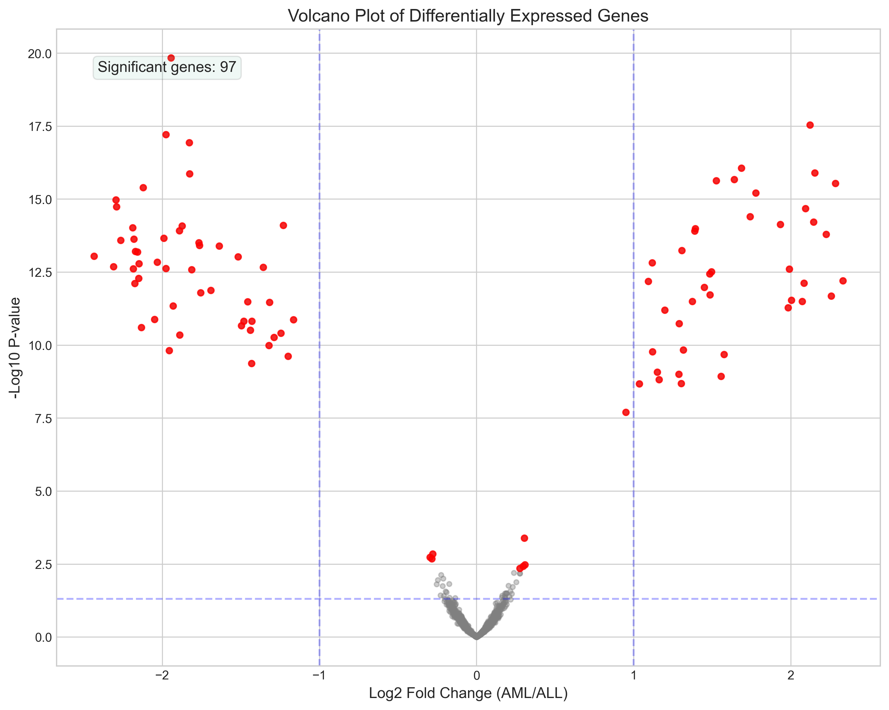
Volcano plot of differentially expressed genes
Step 2: Visualize Gene Expression Patterns
Want to visualize how these genes express across different samples? Just ask:
"Create a heatmap of the top 50 most significantly differentially expressed genes between AML and ALL samples, clustered by expression pattern"
PlotsALot generates a publication-quality heatmap that automatically clusters both genes and samples, uses appropriate color scaling, and includes clear sample type labeling. The visualization immediately reveals expression patterns that separate the cancer types.
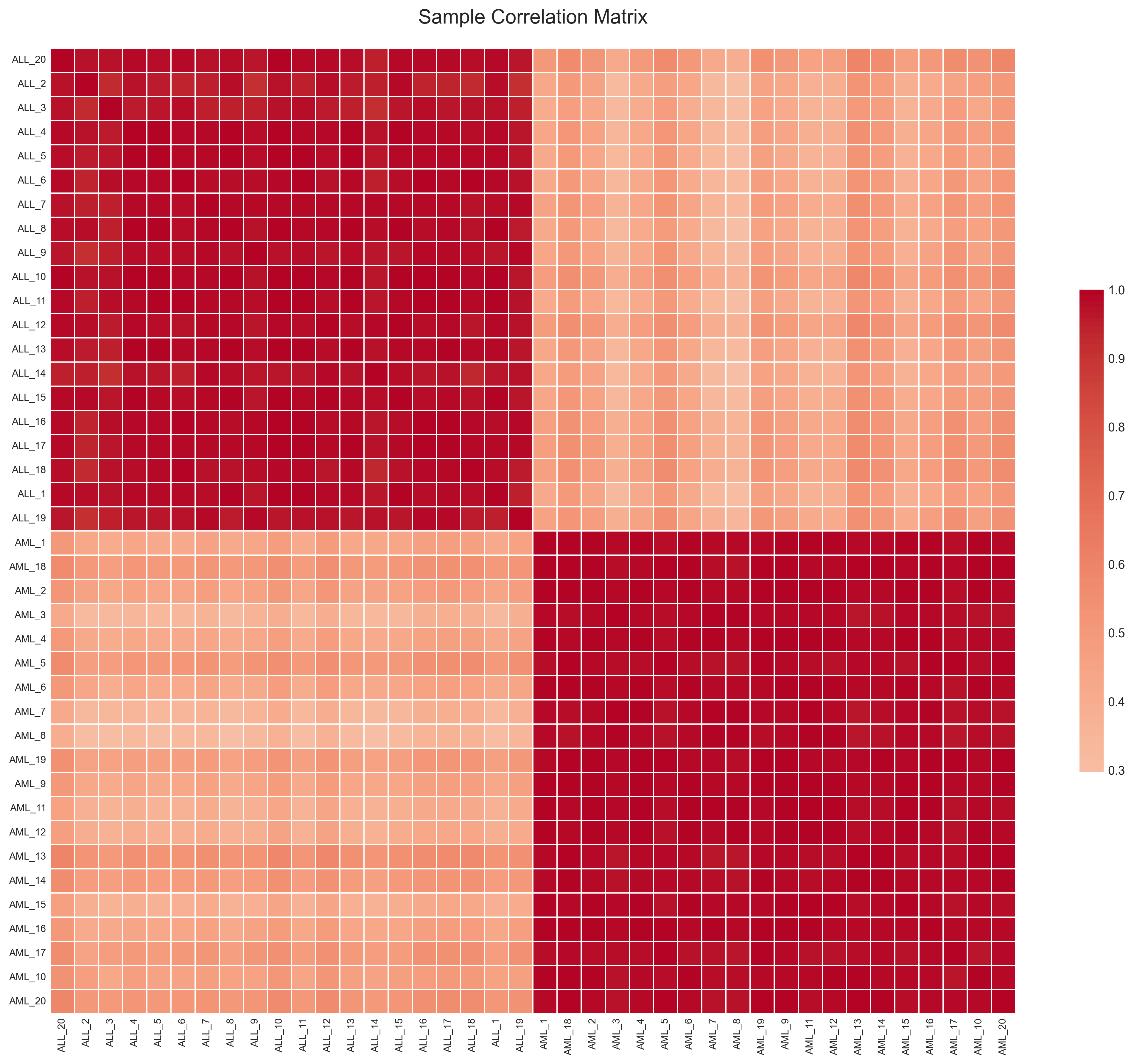
Expression heatmap of top genes
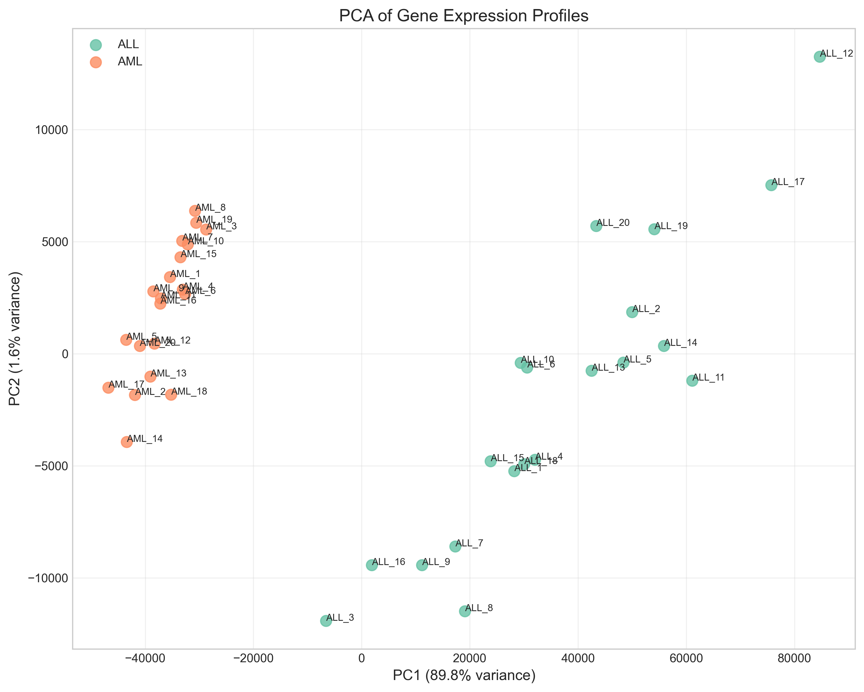
Step 3: Analyze Sample Relationships
Need to understand how samples relate to each other based on their gene expression profiles? Ask:
"Run a Principal Component Analysis on all samples and show me how AML and ALL samples cluster"
PlotsALot performs dimensionality reduction and creates a clear visualization showing how samples group based on their disease type, helping you identify potential outliers or misclassified samples.
PCA of gene expression profiles
Step 4: Correlate Gene Expression with Clinical Outcomes
Want to connect gene expression with clinical outcomes? Simply ask:
"For the significantly differentially expressed genes, which ones most strongly correlate with patient survival time? Show me the top 10."
PlotsALot calculates correlation coefficients between each gene's expression and survival data, applies appropriate statistical testing, and presents the top genes ranked by significance. This immediately highlights potential biomarkers or therapeutic targets for further investigation.
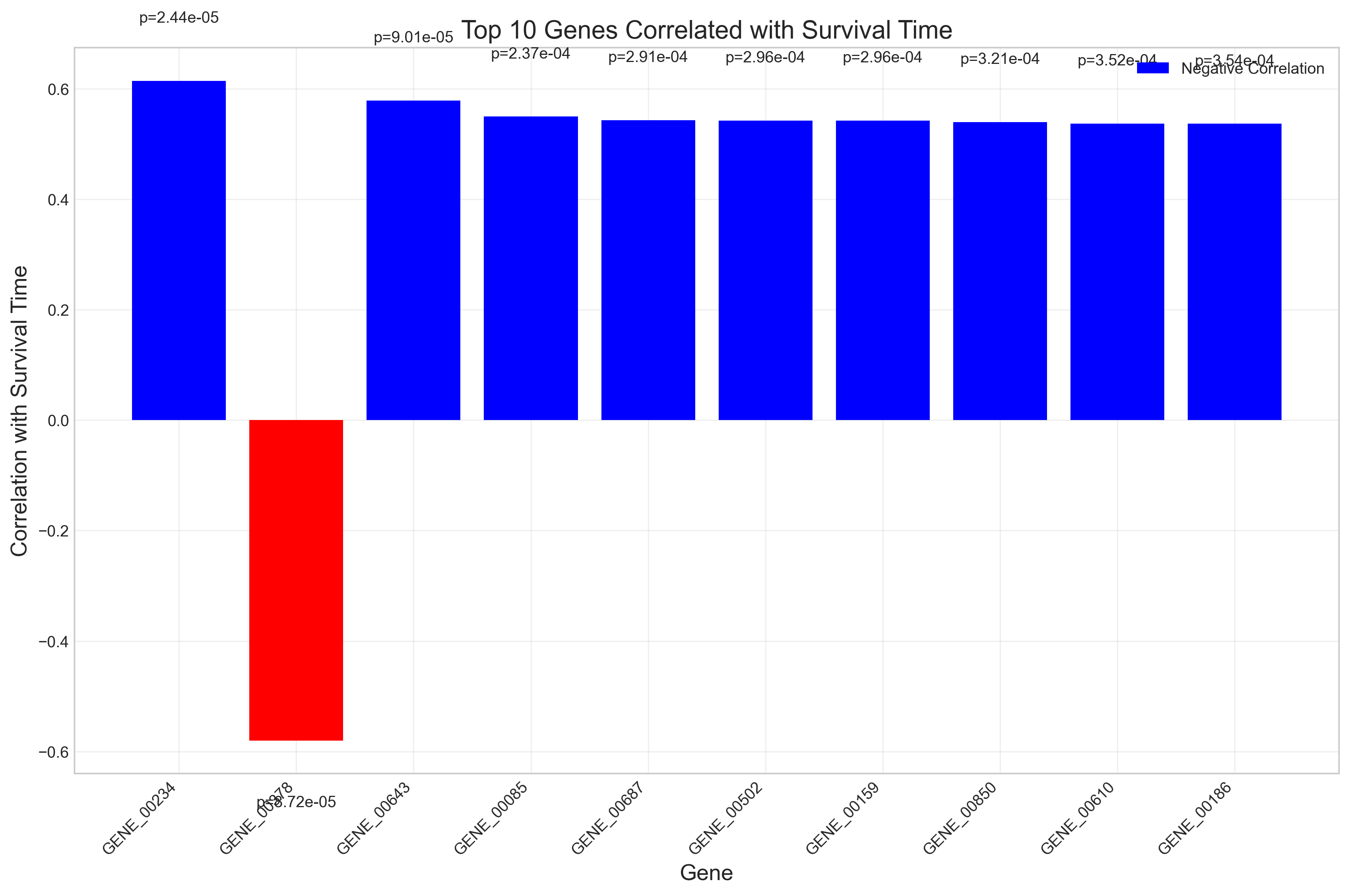
Gene expression correlation with survival
Conclusion
PlotsALot transforms genetic data analysis from a specialized task to an accessible process for all researchers. No need to write complex code or learn specialized bioinformatics tools. Just upload your expression data and ask questions in plain English:
- "Which genes are differentially expressed between AML and ALL samples?"
- "Show me a heatmap of the top 50 differentially expressed genes"
- "Which genes correlate with patient survival time?"
The result? Accelerated research insights without the technical barriers.
See Your Data in Action
Ready to visualize your own data? Try our AI-powered analysis tool and transform your data into beautiful insights.