
11 Best Tools for Creating Graphs and Data Visualizations
Discover the top 11 tools for creating stunning graphs and charts, including PlotsAlot's AI-powered approach, that transform complex data into compelling visual stories without needing design expertise.
In today's data-driven world, the ability to visualize data effectively is essential across all industries. Whether you're a marketer presenting campaign results, a sales professional showcasing quarterly achievements, or a data analyst sharing insights, graphs and charts can bring your data to life, telling compelling stories that words alone cannot convey.
Not everyone has professional design expertise, which is where modern data visualization tools come into play. These platforms offer easy and efficient ways to create stunning graphs that can impress any audience. In this comprehensive guide, we'll explore the top 11 tools for creating graphs, including cutting-edge AI-powered options, offering insights into their unique features and how they can meet your specific needs.
10 Best Tools for Creating Graphs
1. PlotsAlot: AI-Powered Data Visualization with Natural Language
PlotsAlot is a modern web application that combines AI-powered chat interfaces with data visualization capabilities. Simply upload your data and ask the AI to create visualizations in natural language—no coding required. The platform executes Python code in a secure sandbox to generate publication-quality charts.
Notable Features:
- Natural language interface for creating visualizations ("Create a bar chart of sales by region")
- Support for multiple file formats (CSV, Excel, JSON, PDF)
- AI-powered data analysis and insights
- Python code execution in secure sandbox environment
- Multiple chart types including bar, line, pie, scatter, and custom visualizations
- Interactive chat history with message sharing capabilities
- Subscription tiers with scalable file upload limits
- Real-time code execution with instant visualization feedback
Best For: Non-technical users who want to create visualizations through conversation, data analysts exploring datasets interactively, teams needing rapid visualization prototyping without writing code.
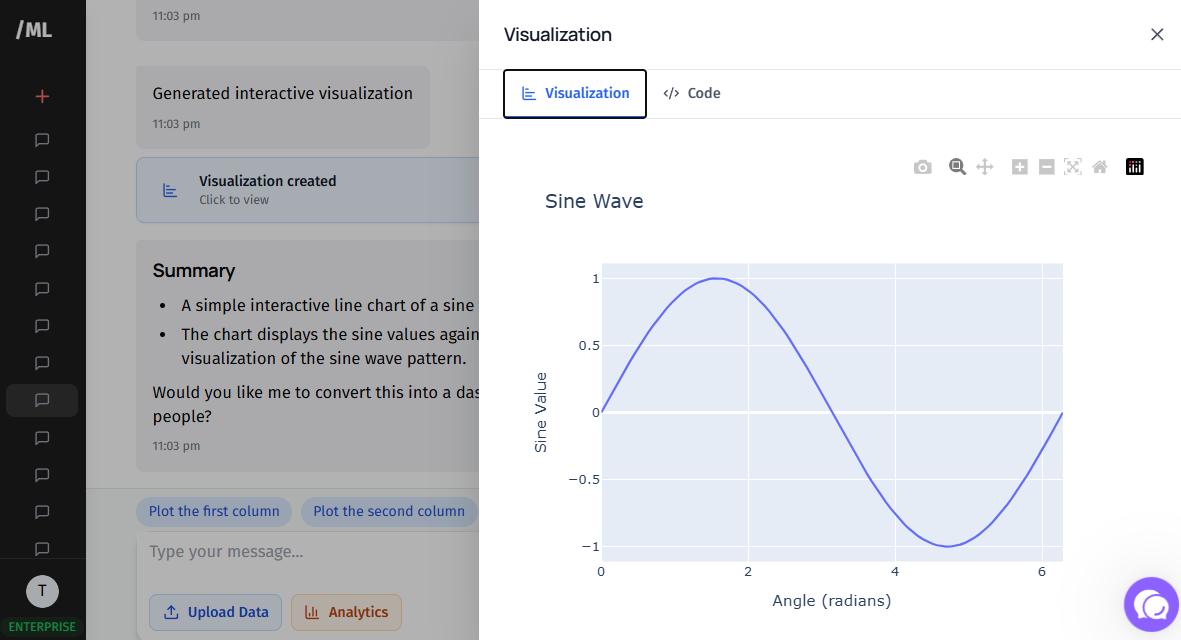
PlotsAlot Chat Interface
2. Google Charts
Google Charts is ideal for organizations wanting to build charts directly from data tables and Google Sheets. It offers a wide range of interactive charts and seamless integration with Google's ecosystem of tools.
Notable Features:
- Deep integration with Google products for a unified workflow
- Real-time data display capabilities for dynamic dashboards
- Interactive features with extensive template gallery
- Free to use with comprehensive documentation
Best For: Teams already using Google Workspace who want quick, interactive visualizations without additional software costs.
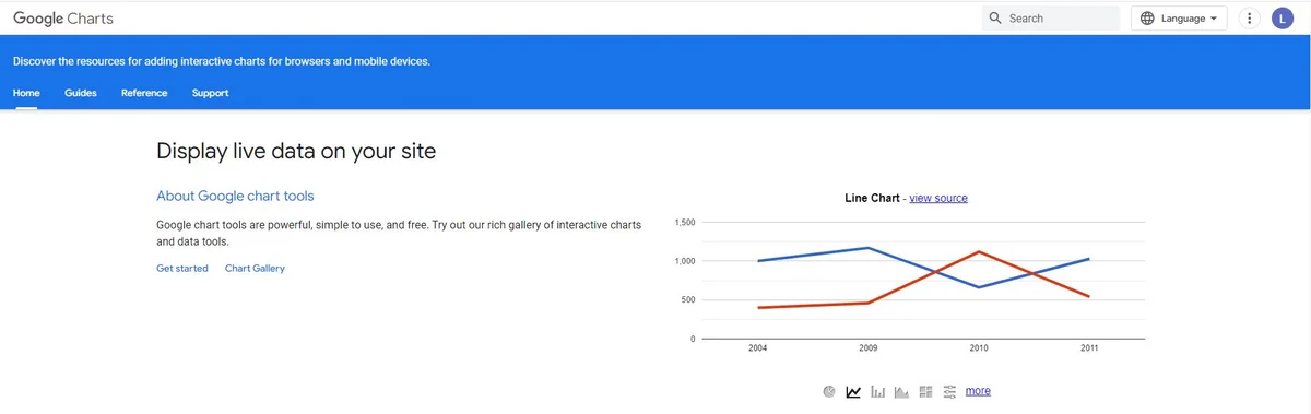
Google Charts Interface
3. Databox
Databox consolidates all your data into one centralized location, making it especially useful for marketing professionals who need to create dashboards quickly without coding knowledge.
Notable Features:
- One-click integrations with popular marketing and analytics tools
- Pre-built reports and customizable data calculations
- Automated dashboard creation for comprehensive metric overviews
- Mobile-friendly interface for on-the-go monitoring
Best For: Marketing teams who need to monitor KPIs across multiple platforms in real-time.
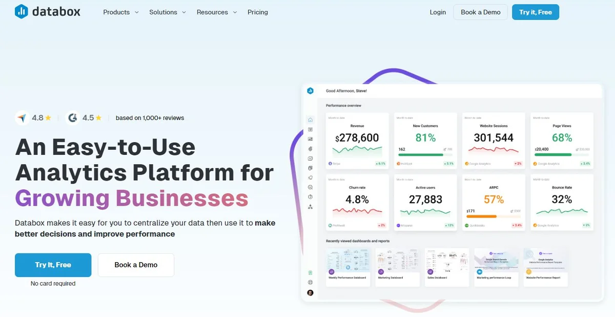
Databox Dashboard Example
4. Tableau
Tableau stands out as a premier choice for enterprises seeking automated data visualization with real-time analysis capabilities. It supports various data analytics applications across marketing, IT, government, and business intelligence.
Notable Features:
- Real-time analysis capabilities with automatic updates
- Support for both mobile and desktop devices
- Extensive customization options through JavaScript extensions and APIs
- Drag-and-drop interface for intuitive chart creation
- Advanced analytics including trend lines, forecasting, and statistical summaries
Best For: Large organizations that need enterprise-grade analytics with sophisticated visualization capabilities.
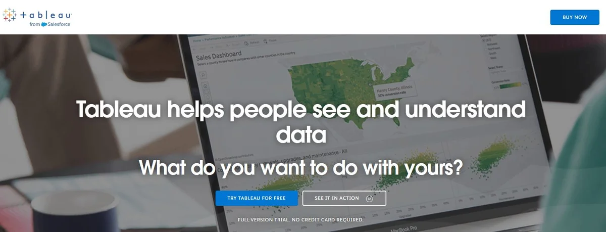
Tableau Analytics Platform
See Your Data in Action
Ready to visualize your own data? Try our AI-powered analysis tool and transform your data into beautiful insights.
5. Plotly
For enterprises requiring AI and data science capabilities at scale, Plotly provides a flexible interface with robust team collaboration features and support for custom dashboards and reports.
Notable Features:
- Flexible team collaboration options with shared workspaces
- Support for Python, Node.js, and R programming languages
- Custom dashboard and report generation for comprehensive data analysis
- Interactive visualizations with zoom, pan, and hover capabilities
- Scientific and statistical chart types
Best For: Data science teams and researchers who need programmatic control over visualizations.
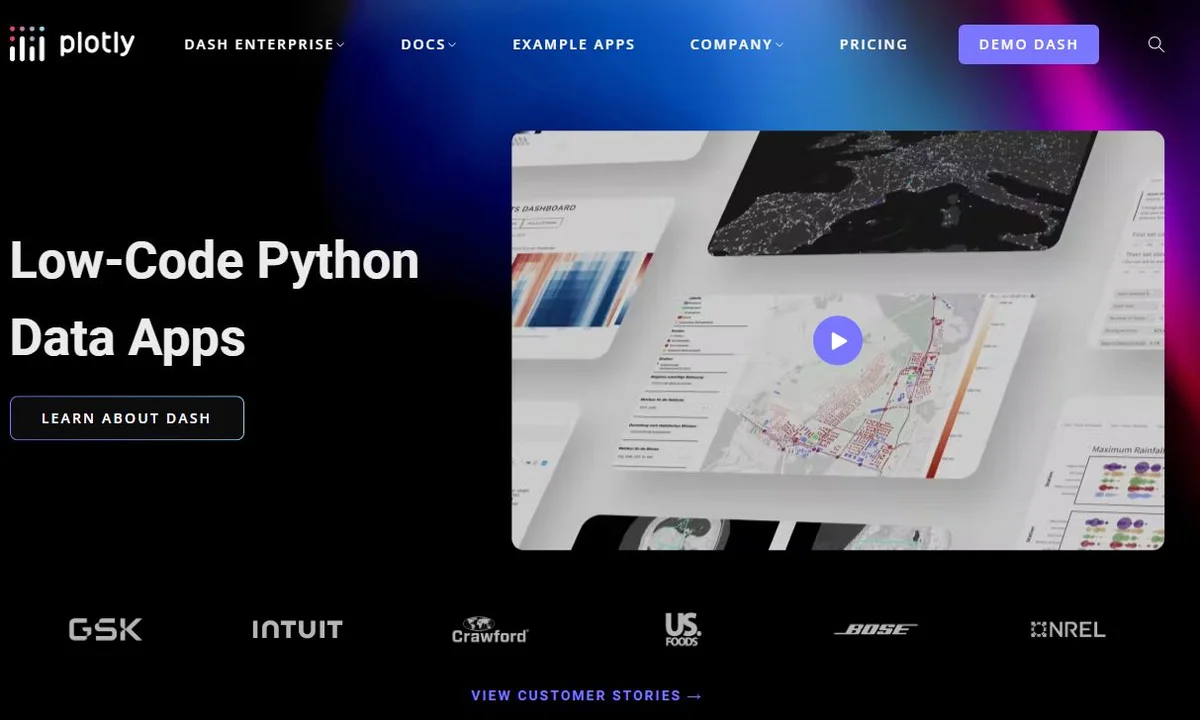
Plotly Analytics Platform
6. ChartBlocks
ChartBlocks is a powerful solution for businesses in healthcare, travel, insurance, and retail, enabling them to import data from various sources and quickly create shareable charts.
Notable Features:
- Swift data upload and chart generation
- Versatility in creating multiple chart types from a single data file
- Social media integration for easy sharing
- Customizable templates for consistent branding
- No coding required
Best For: Small to medium businesses that need quick, professional charts without technical complexity.
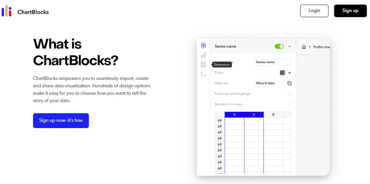
ChartBlocks Interface
7. Datawrapper
An excellent option for students, journalists, and small businesses, Datawrapper is a free, open-source tool that allows for the creation of charts, maps, and tables without any coding skills.
Notable Features:
- Rich selection of premade graphics for quick starts
- Auto-saving of visual edits to prevent data loss
- User-friendly editing and annotation tools
- Responsive design that works on all devices
- Publication-ready exports
Best For: Journalists, educators, and nonprofits who need publication-quality visualizations on a budget.
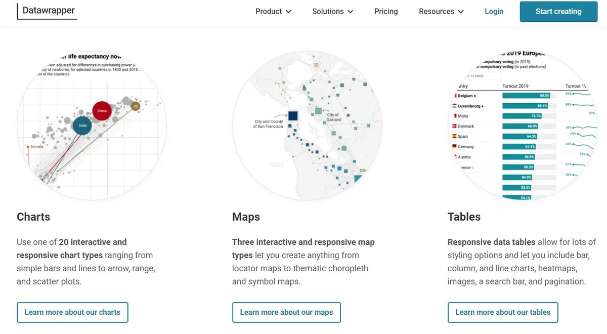
Datawrapper Interface
8. FusionCharts
Tailored for large organizations, FusionCharts offers a JavaScript-based data visualization platform with an extensive library of over 100+ charts and 2000+ maps. It's perfect for creating detailed project or product dashboards.
Notable Features:
- Extensive selection of interactive charts and geographic maps
- Customizable designs for personalized dashboards
- Cross-browser compatibility for consistent rendering
- Visual discovery features that enhance usability
- Export capabilities to multiple formats (PNG, JPG, SVG, PDF)
Best For: Developers and organizations building custom web applications with embedded analytics.
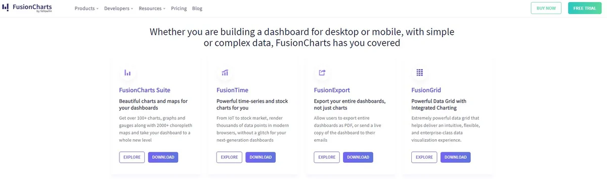
FusionCharts Interface
9. Juicebox
For consultants and knowledge workers looking to impress clients and stakeholders, Juicebox offers a unique storytelling approach to data visualization, enabling the creation of interactive data stories.
Notable Features:
- Storytelling approach to data presentation with narrative flow
- Responsive design for attractive displays on all devices
- Integration capabilities for pulling data from multiple sources
- Guided analytics that walks users through insights
- Collaboration features for team-based analysis
Best For: Consultants and business analysts who need to create compelling, narrative-driven presentations.
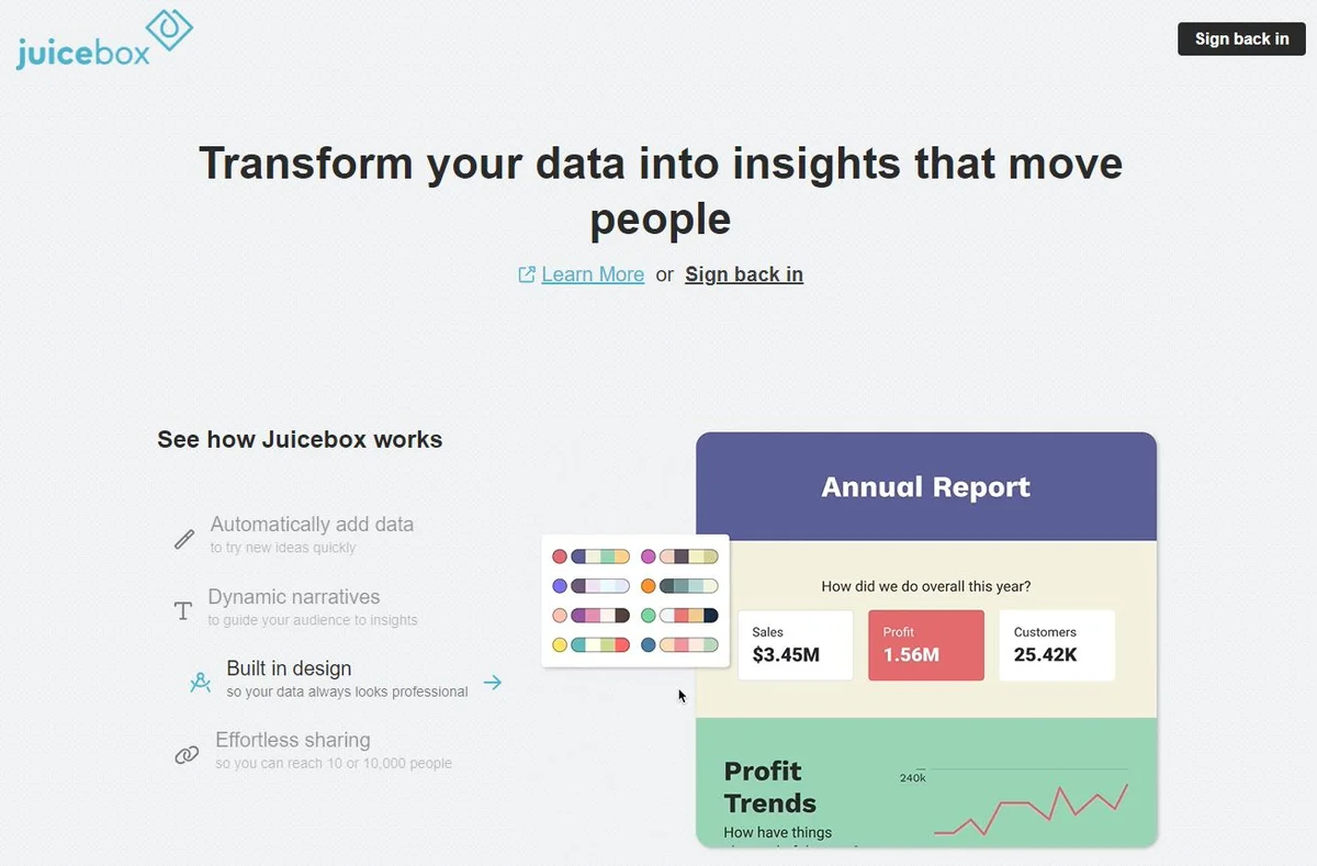
Juicebox Interface
10. Zoho Analytics
Focused on security and enterprise features, Zoho Analytics is suitable for medium to large enterprises, offering an intuitive dashboard, AI-based assistance, and the ability to embed reports in websites and social media.
Notable Features:
- Intuitive dashboard for multifaceted data fetching
- Embedding capabilities for websites and social media platforms
- AI assistant ("Zia") for enhanced data visualization and insights
- Comprehensive security features including SSL encryption
- Automated report scheduling and distribution
Best For: Enterprises that prioritize data security while needing robust analytics capabilities.
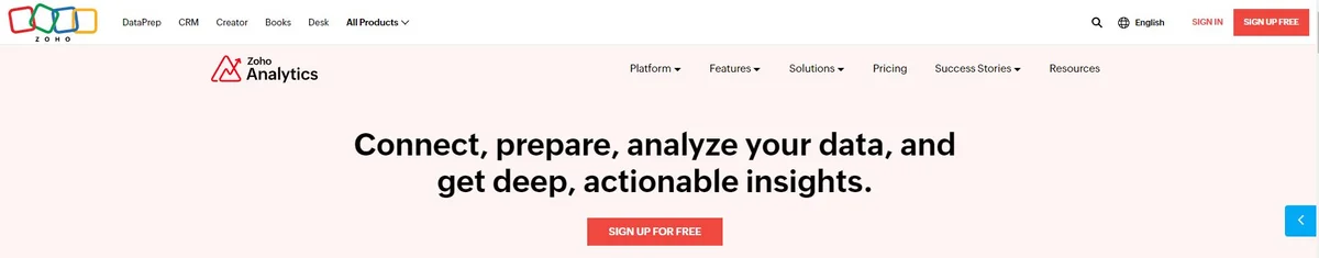
Zoho Analytics Interface
11. Microsoft Power BI
Microsoft Power BI is a comprehensive business analytics solution that integrates seamlessly with the Microsoft ecosystem. It offers powerful data transformation, modeling, and visualization capabilities.
Notable Features:
- Deep integration with Microsoft products (Excel, Azure, etc.)
- Natural language query capabilities with Q&A feature
- Real-time dashboard updates
- Extensive connector library for data sources
- Mobile app for accessing reports on-the-go
Best For: Organizations heavily invested in Microsoft technologies who need enterprise analytics.
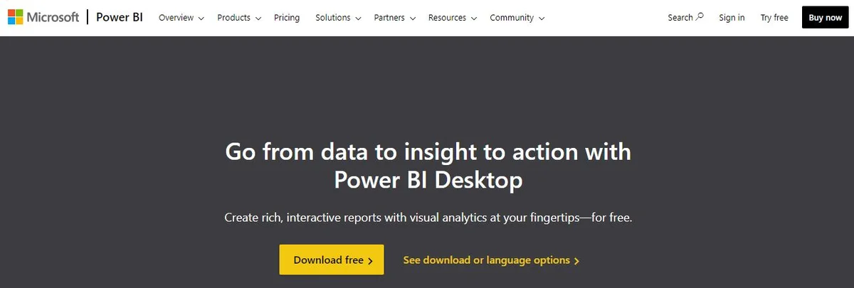
Microsoft Power BI Interface
How to Choose the Right Visualization Tool
Selecting the right data visualization tool depends on several key factors:
1. Data Complexity
Consider how complex your data is. Simple datasets might work well with Google Charts or Datawrapper, while complex multi-source data may require Tableau or Power BI.
2. Customization Needs
If you need highly customized visualizations, tools like Plotly or FusionCharts offer more control. For quick, template-based charts, Databox or ChartBlocks are better suited.
3. Budget Constraints
Free tools like Google Charts, Datawrapper, and the free tiers of many platforms can be sufficient for basic needs. Enterprise solutions like Tableau and Power BI require budget allocation but offer advanced features.
4. Technical Expertise
No-code tools like Datawrapper and ChartBlocks are ideal for non-technical users, while Plotly and FusionCharts cater to developers who want programmatic control.
5. Integration Requirements
Consider what other tools you use. If you're in the Google ecosystem, Google Charts makes sense. Microsoft users should consider Power BI. Marketing teams might prefer Databox for its marketing tool integrations.
6. Audience and Purpose
Publication-quality charts for external audiences might require Datawrapper or Juicebox. Internal dashboards for monitoring might work well with Tableau or Zoho Analytics.
Best Practices for Data Visualization
Regardless of which tool you choose, follow these best practices to create effective visualizations:
-
Choose the Right Chart Type: Match your chart type to your data and message. Use bar charts for comparisons, line charts for trends, and pie charts for proportions.
-
Keep It Simple: Avoid cluttering your visualizations with unnecessary elements. Focus on the key message you want to convey.
-
Use Color Purposefully: Employ color to highlight important data points or group related information, but don't overdo it.
-
Label Clearly: Ensure all axes, data points, and legends are clearly labeled so viewers can understand your visualization without explanation.
-
Tell a Story: Arrange your visualizations to guide viewers through your data narrative, building from context to insights to conclusions.
-
Make It Accessible: Consider color-blind friendly palettes and ensure your charts are readable at different sizes and on different devices.
Conclusion
The right data visualization tool can transform raw data into meaningful stories that drive decisions and inspire action. From PlotsAlot's innovative AI-powered conversational interface to Google Charts' simplicity to Tableau's enterprise power, each tool offers unique strengths for different use cases.
For beginners and those needing quick results, start with PlotsAlot if you prefer natural language interaction, or try free options like Google Charts or Datawrapper. If you prefer a conversational approach to visualization, PlotsAlot offers an intuitive AI-powered interface where you can upload data and ask for visualizations in plain English. As your needs grow more sophisticated, consider investing in enterprise solutions like Tableau, Power BI, or Plotly that offer advanced analytics and customization.
The key is to match the tool's capabilities with your specific requirements around data complexity, customization needs, budget, technical expertise, and integration requirements. By choosing wisely and following visualization best practices, you can create impactful graphs that make your data truly shine.
Ready to start visualizing your data? Explore these tools and discover which one best fits your workflow. With the right visualization tool at your fingertips, you'll be transforming complex data into clear insights in no time.
Frequently Asked Questions
What are the 4 main visualization types?
The four main types of data visualization include charts (such as bar, pie, and line charts), graphs (including scatter plots and histograms), maps (like heat maps and geographic maps), and dashboards (interactive visual summaries combining multiple data views). Each type serves unique purposes depending on the data and audience.
What is a visualization tool?
A visualization tool is software designed to transform raw data into visual formats like graphs, charts, or maps. These tools make complex information more accessible and engaging, helping users identify trends, patterns, and insights for better decision-making and communication.
How to choose a visualization tool?
Selecting the right visualization tool depends on your data complexity, customization needs, and target audience. Consider factors like ease of use, integration with other platforms, your budget, and the tool's ability to create visuals that align with your specific objectives, whether creating simple charts or detailed dashboards.
See Your Data in Action
Ready to visualize your own data? Try our AI-powered analysis tool and transform your data into beautiful insights.